Lap Comparison
Lap comparison lets you overlay up to three laps side by side to understand exactly where you're gaining or losing time.
Selecting Laps
From the session detail page, select laps to compare by clicking the comparison checkbox next to each lap. You can compare:
- Laps from the same session (e.g., your best vs. your average)
- Your current best vs. a previous session's best
Each selected lap is assigned a distinct color for easy identification.
Delta Chart
The delta chart is the most powerful comparison tool. It shows the cumulative time difference between two laps plotted against distance:
- Line going down — the comparison lap is faster at that point
- Line going up — the reference lap is faster
- Flat sections — both laps are equally fast
What to Look For
- Sudden drops during braking zones mean the faster lap braked later or harder
- Gradual gains through corners indicate better cornering speed or line
- Gains on straights often come from better corner exit speed
Telemetry Overlay
All telemetry channels are overlaid with the same color coding as the lap selection. This lets you directly compare:
- Braking points and intensity
- Throttle application timing
- Cornering speed
- Gear selection
- Steering input
Track Map Overlay
The racing lines from all selected laps are drawn on the track map simultaneously. Different colored lines show exactly how your positioning varies between laps, especially useful for identifying alternative lines through corners.
Worked Example: Reading a Delta Chart
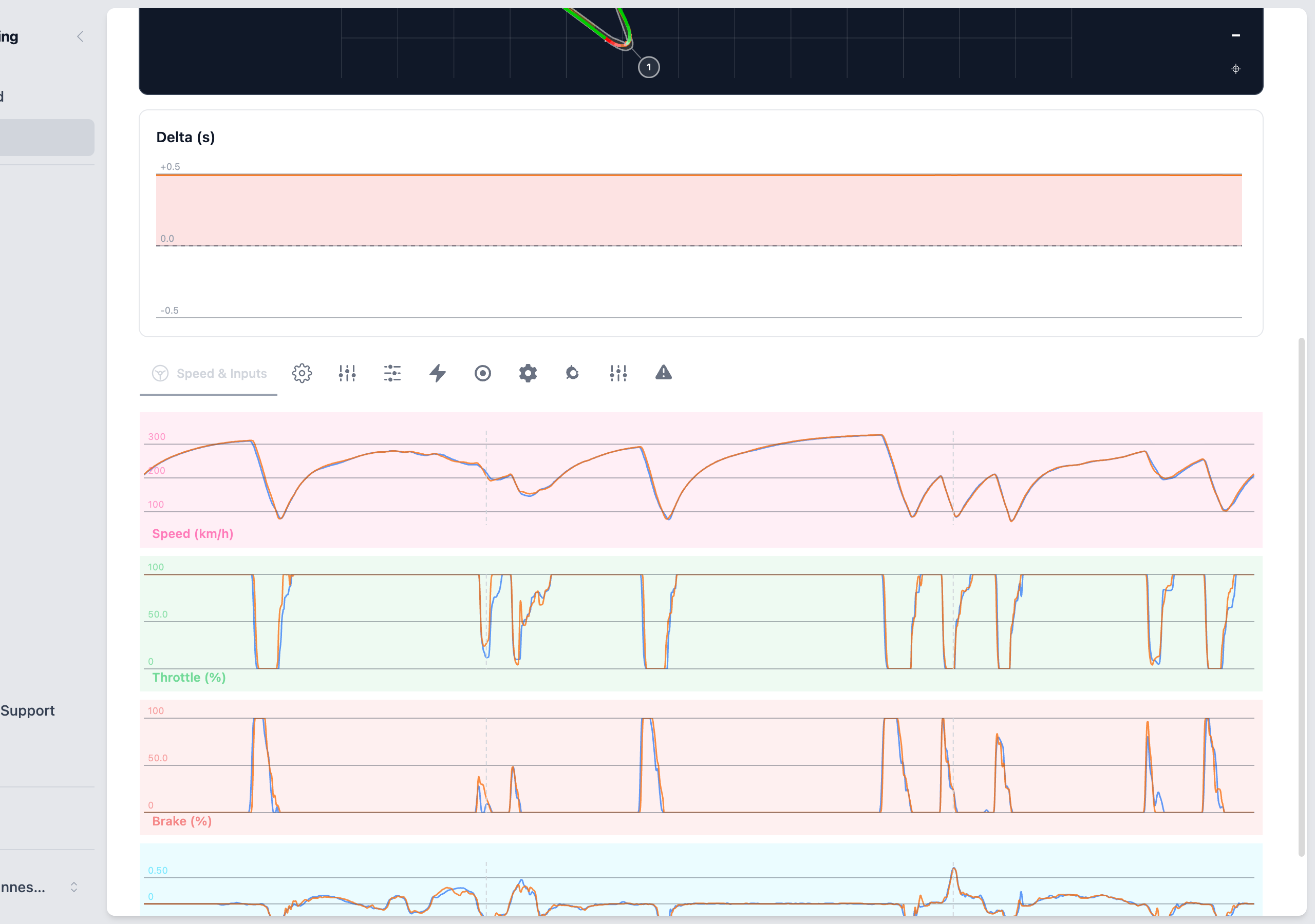
Consider a delta chart where the line drops 0.15 seconds at Turn 3 entry. This tells you:
- The comparison lap braked later or carried more speed into the corner
- The time was gained in the braking zone, not the corner itself
- If the delta stays flat through the rest of the corner, the faster entry didn't compromise the exit
But if the delta rises back up through Turns 3–4, the aggressive entry actually cost time on exit. The net gain might be zero or negative. Always trace the delta through the full corner and the following straight.
Common Delta Patterns
- Step down at corner entry — Later or harder braking. Cross-check with the brake trace.
- Gradual drop through a corner — Higher cornering speed or better line. Compare speed traces.
- Rise on a straight — Worse exit speed from the previous corner. The preceding corner exit is the culprit, not the straight itself.
- Flat throughout — Both laps are identical in this section. Move on to where the differences are.
Correlating Delta with Telemetry
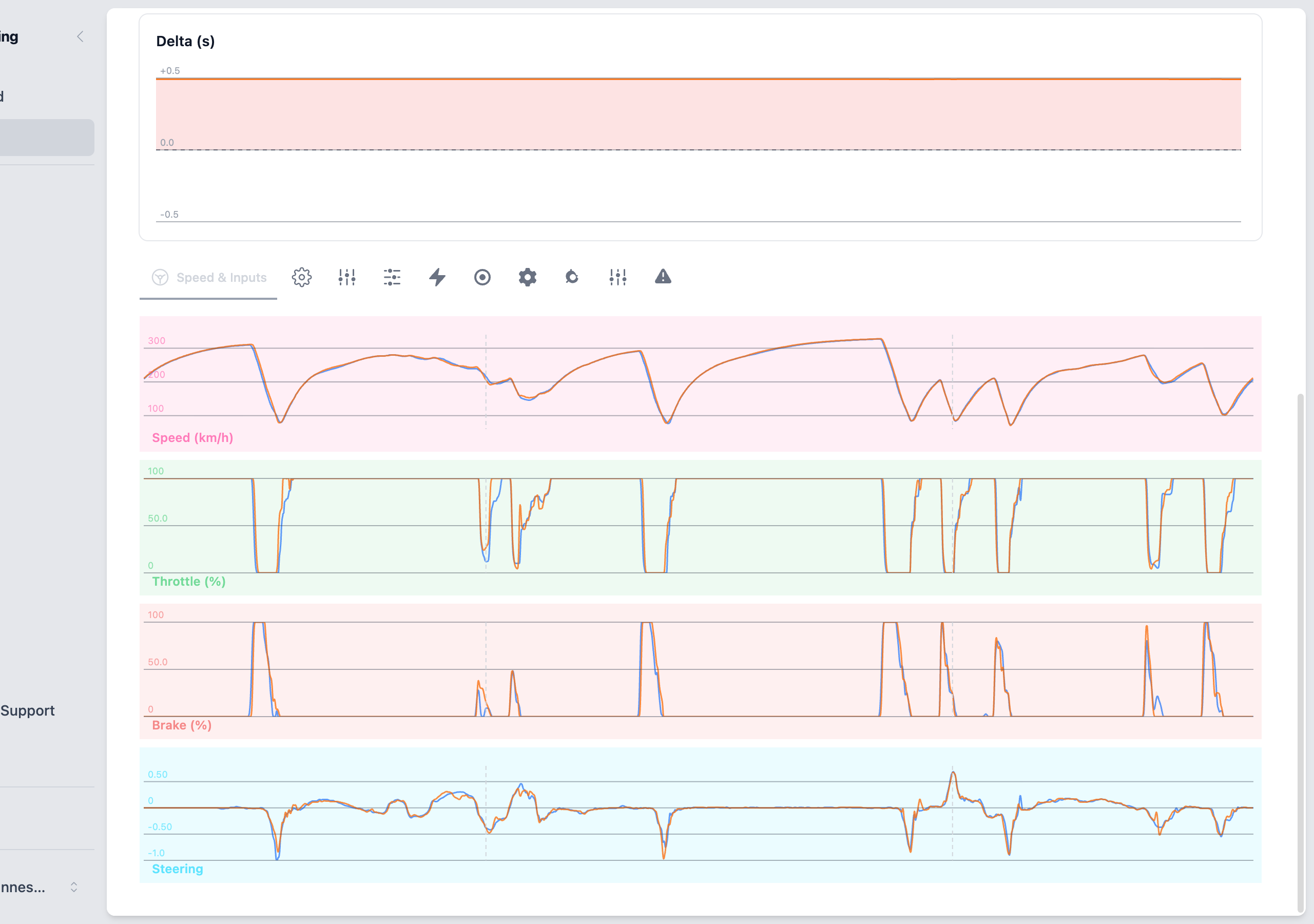
The delta chart tells you where time is gained or lost. The telemetry overlay tells you why:
- Find a section where the delta changes significantly
- Zoom into that section on the telemetry charts
- Compare the specific channels — was the brake point different? Was throttle applied earlier? Was minimum speed higher?
- Use Corner Analysis for quantified factors at that corner
Color Coding
Each selected lap gets a consistent color across all views:
- The delta chart uses the same colors as the telemetry overlay
- The track map racing lines match the same color coding
- The lap list sidebar shows the color next to each selected lap number
This makes it easy to track which lap is which as you switch between views.
See also: Reading Telemetry for trace interpretation, Corner Analysis for per-corner breakdown