Telemetry Charts
Telemetry charts visualize data channels as graphs plotted against distance or time. They're your primary tool for understanding what happened on each lap.
Chart Layout
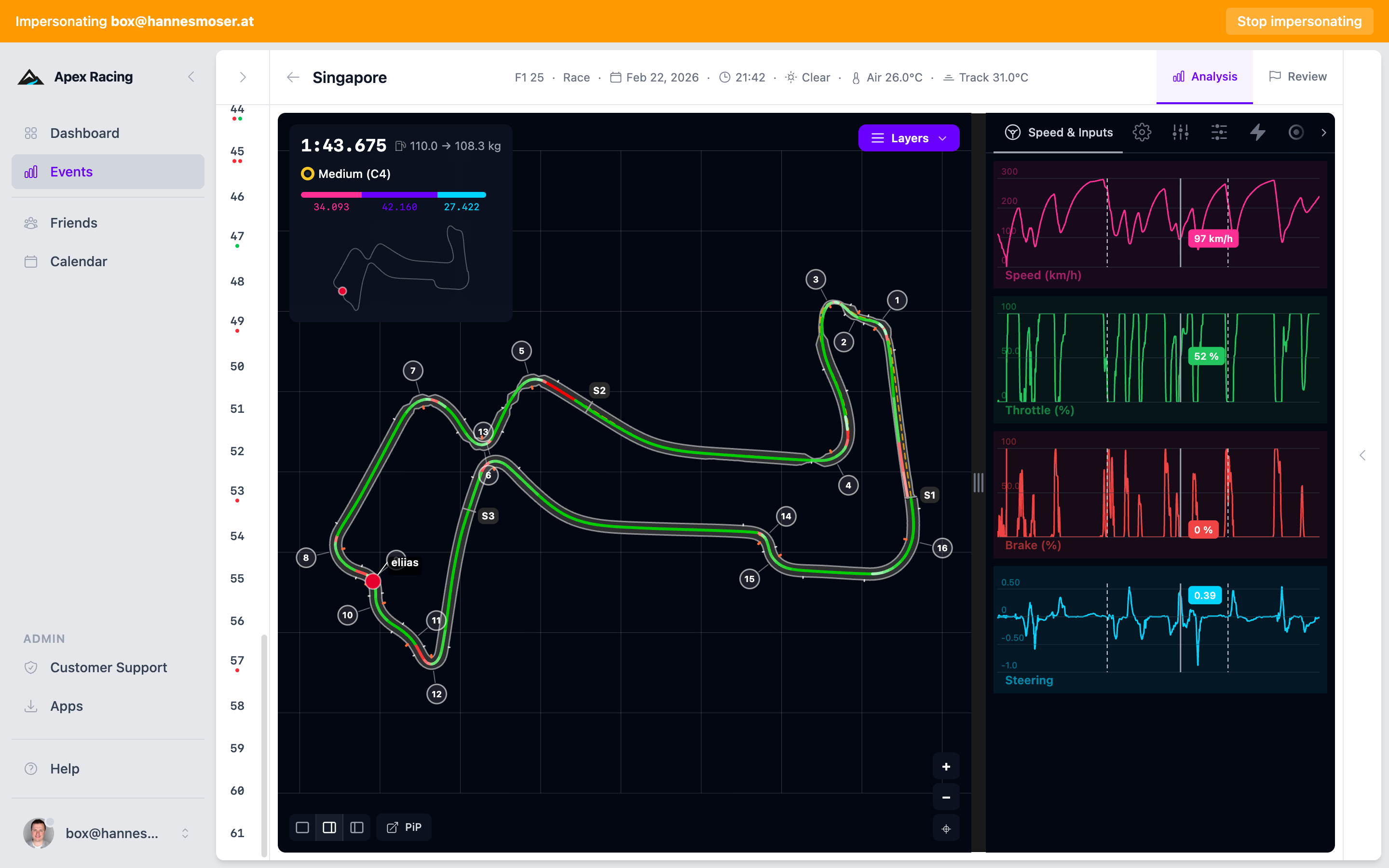
Each chart shows one or more telemetry channels:
- X axis — distance around the lap (meters) or elapsed time
- Y axis — the channel value (speed in km/h, throttle as %, etc.)
The default view shows the three fundamental channels — speed, throttle, and brake — stacked vertically with a shared X axis. This is the single most useful view for understanding a lap.
Reading Speed Traces
The speed trace is the most information-dense channel. The shape of each corner tells a story:
V-Corner (Hairpin)
Sharp deceleration to a low minimum speed, followed by sharp acceleration. The trace forms a V shape. These are heavy braking zones where brake technique matters most. Look for how deep the V goes (minimum speed) and how quickly it recovers (exit quality).
U-Corner (Long Constant-Radius)
Gradual deceleration, a sustained period at roughly constant speed, then gradual acceleration. The trace forms a wide U. These corners reward smooth, consistent inputs over raw braking performance.
Flat-Bottom (Chicane)
A quick dip in speed with almost no time at the minimum. The trace barely touches its lowest point before recovering. Chicanes test car balance and the driver's ability to link corners smoothly.
Straights
Between corners, the speed trace should climb steadily to a peak. The peak speed tells you about aero/power setup. The time to reach peak tells you about exit quality from the previous corner — a slow climb means you compromised the exit.
Reading Brake Traces
The brake trace reveals your braking style and consistency:
- Shape — A sharp rise to peak pressure followed by a gradual taper is the ideal trail braking shape. A flat block of pressure means threshold braking. A gradual ramp-up signals hesitation.
- Start point — Where the trace first rises from zero is your brake point. Compare this across laps.
- Release pattern — How the trace returns to zero matters as much as how it starts. A smooth, linear release = good trail braking. An abrupt drop = lost front grip at turn-in.
See Reading Brake Input for detailed brake trace interpretation.
Reading Throttle Traces
The throttle trace shows how you manage power:
- Exit ramp — A smooth, progressive rise from 0% to 100% as the car straightens is ideal. A jump to 100% suggests binary throttle application.
- Coasting gaps — Flat sections at 0% between brake release and throttle application represent lost time. The car is neither braking nor accelerating.
- Mid-corner modulation — Dips and corrections indicate oversteer or lack of confidence.
See Reading Throttle Input for detailed throttle trace interpretation.
Correlating Channels
The real power of telemetry comes from reading channels together:
- Steering + Lateral G — When steering angle increases but lateral g plateaus, you have understeer. The car can't turn as much as you're asking.
- Throttle + Speed — If throttle is at 100% but speed isn't increasing proportionally, you likely have wheelspin. Compare with wheel slip ratio to confirm.
- Brake + Longitudinal G — Brake pressure vs deceleration. If pressure is high but deceleration is low, the tires may be locked or close to locking.
- Speed + Lateral G — Higher speed with the same lateral g means more efficient cornering (less scrub).
Comparing Channels
You can overlay multiple channels on the same chart or view them stacked vertically. Overlays are useful for seeing direct correlations — for example, how throttle input maps to speed.
Zoom and Pan
- Click and drag horizontally to zoom into a section of the lap
- Scroll to zoom in and out
- Double-click to reset the zoom
Zoom Workflow
- Start with the full lap view to identify areas of interest
- Zoom into a specific corner or braking zone
- Examine the fine detail of inputs and car response
- Compare with another lap at the same zoom level
Zooming is synchronized across all charts — when you zoom on speed, throttle and brake zoom to the same section.
Data Markers
Hover over the chart to see exact values at any point. A vertical crosshair shows the current position, with readouts for each active channel.
When viewing multiple laps in comparison mode, the crosshair syncs across all traces so you can see the exact difference at any point on track. The track map highlights your current position simultaneously.
See also: Reading Telemetry for interpretation fundamentals, Lap Comparison for multi-lap analysis